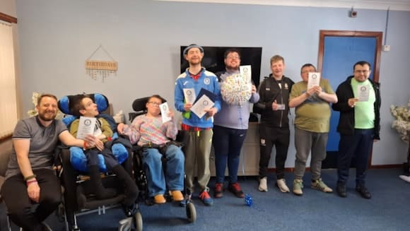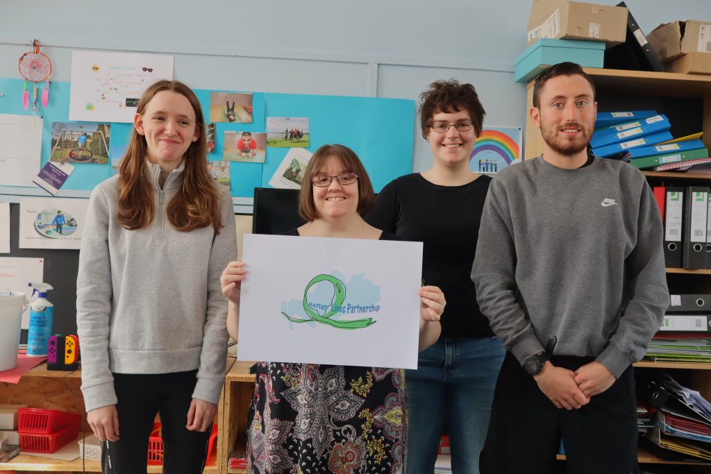
Better Lives Partnership (BLP) is announcing a small change to their logo.
Young people designed BLP’s original logo and the organisation has always felt
that it is a true representation of BLP’s identity and what they are trying to
achieve.
The logo and what it represents have remained an important symbol to
the Better Lives team in the six years since it became a registered SCIO in June
2016. However, so is moving forward and adapting to remain in accordance with
their key principles and continuing to prioritise the accessibility and inclusivity of
Better Lives Partnership.
Recently, BLP has been working with Creatomatic on the organisation’s exciting
new website and has been working hard to ensure it is accessible. Unfortunately,
our old logo doesn’t meet the criteria needed for readability for users with
impaired vision, due to the lack of contrast between the blue background and
the dark blue lettering.
Therefore, the decision was made to make a small change and replace the blue
background with a white one instead. The rest of BLP’s young people’s original
design is remaining very much the same.
Anne McEwan, Better Lives Partnership’s Project Coordinator, says about the
change to the logo:
“It has been great working with the Creatomatic team to ensure that we remain
true to our principles of accessibility while continuing to retain the core elements
of design our young people contributed to our branding.
We look forward to showcasing our new website very soon!”
The whole of Better Lives Partnership is excited to adopt this accessible new logo.
One partner. No competitors. Supporting local stories across the region.